
On this colour palette there are very bright colours and I will use some of these colours because they will help to attract people to my magazine. Another reason why I might use some of these colours is because I will go well with the white background that I am going to use. The colours that I will use on this palette is the lime green, red and the blue, I have chosen these because I feel that they are the best colours to get someone's attention, also they will look the best on the white background that will be on my magazine.

The colours on the pastel row are very soft and would not go well on a magazine with a white background because people will find it hard to see them on the magazine, so I will not be using any of these colours. For the earth tone colours the are much more natural and really depends on the genre of music that I'm doing. If the genre of music is classical then some of the colours would look good but if I'm doing something like rock then them sorts of colours will not look good. The colours on mysterious are sort of darker then the rest, so if I was to use a colour from that row it would be the dark green because I think that it will look good for the double page spread.
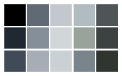
On this colour palette I like the black because I think that it will stand out the best on a white background, also black would be the best colour for the text on the double page spread because it is the best colour for that. Also black is the perfect match for white which means that they will fit together perfectly. So in my magazine I will be using the colour Black for the text on the inside of the magazine.
No comments:
Post a Comment