Friday, 31 January 2014


Thursday, 30 January 2014
Monday, 27 January 2014
Artist profile
Artist name: Teagle
Music style: R&B, Hip Hop
Inspiration: R.Kelly, Chris Brown, Kanye West, Ne-Yo, Justin Timberlake, Usher, Beyonce & Drake
Album name: Nasty Habits
The cover
Male- tall, slight beard, sweatshirt or t-shirt or jacket, maybe snapback or beanie or no hat at all. Smart/causal clothing.


Music style: R&B, Hip Hop
Inspiration: R.Kelly, Chris Brown, Kanye West, Ne-Yo, Justin Timberlake, Usher, Beyonce & Drake
Album name: Nasty Habits
The cover
Male- tall, slight beard, sweatshirt or t-shirt or jacket, maybe snapback or beanie or no hat at all. Smart/causal clothing.


Sunday, 26 January 2014
Institution

Prometheus Global Media
I think that this institution is the best fit for my magazine because they are the institution for one of the best mainstream magazines around which is Billboard. Prometheus GM is based in New York and its magazines are sold in over 100 countries around the world. This would mean that my magazine has a great chance of success because it is with this institution as they are very successful in the things they do because Billboard has won many awards, also because Prometheus GM is based in New York it has the best chance to be publicized to the world because New York is one of the busiest places in the world and a lot of music related items such as albums are advertised there for millions of people to see. Also they could advertise my magazine with the other magazine that they produce such as the Hollywood reporter. So this is why i think that Prometheus GM is the best institution for my magazine.
Thursday, 23 January 2014
Respond to staff feedback

The staff feedback that i have received was very helpful because I have been told to add more so some of my posts so that i can gain a better grade. Also I have to make my 20 songs that have inspired me into one playlist so that it is easier to listen to. To my photographers research I have to add more photos to the photographer and i have to research on one more photographer and graphic designers. To the post about my genre of music I have to add more images and videos, for the fonts post I have to neaten it up so that it looks presentable to the person looking at it. So firstly I will make my 20 songs into a playlist so that it looks better and it will be easier to access, I will do this by logging on to soundcloud and then create a playlist. Next on the list is add more photos to my photographers research so that people can see what type of photos I want to include in my magazine, I will do this by going onto Google images and getting more photos. Lastly I will add more videos and images to the genre of music post so that people have a better understanding of my genre choice.
Wednesday, 22 January 2014
Reflect on all preliminary work
How does your prelim represent particular social groups?
My prelim magazine represents the people
who are sports minded, interested in playing in sport and enjoy taking part in
sporting actives.
Who would be the intended audience for
your product?
The intended audience for my prelim
magazine is the people in school who take part in the sporting activities
going on in the school also it is intended for people who just enjoy sports as
a whole. The activities could be anything football, rugby and netball any
activity that is within the school. Also this magazine is intended for the
students who are interested in the results of the games being played by the
school, even more the PE teachers that want to know more about the games and
have a full match report of the games.
How did you attract/ address your
audience?
To attract the intended audience of my
magazine which is sports enthusiasts, I used a common colour used by the sports
industry which is red. Red is used in almost all types of sport whether it is
Football or Gymnastics, so I thought that using the colour red as the colour of
my title would attract people who like sports to my
magazine because they are familiar with that colour.
Another thing to do with the title is the font that I use for it; it’s kind of
like an old school type of font and it
reminded me of the font used by American Football teams so I thought that it
would make the title stand out. Next the clothing that I used for Brad is sport
related because it is a Porto FC shirt , the colour of the shirt also helps
attract people because it is a blue top and the magazine background is white is
stands out with more effect. Another reason why the blue attracts people is
because of the colour used in the title, red and blue go very well together on
a white background.
What have you learnt about technologies
from the process of constructing this product?
Using Photoshop for the prelim magazine, I have
learnt how to use Photoshop from the start as I have never used it before. I have
learnt to cut around pictures to get the part that I want, how to re-size
pictures and I have learnt how the layer system work in Photoshop.
Sunday, 19 January 2014
20 song playlist that have inspired me
These are the songs that have made me enjoy and like R&B/Mainstream songs, i like the lyrics said in the songs and the way the beat and rhythm goes. My intended target audience will like these songs because most of them are mainstream songs that have been either top of the charts or somewhere near there. Also they give out a good vibe to the people who are listening to them. So this is why i have chosen these songs.


Saturday, 18 January 2014
Photographers research
Terry Richardson- This is one of the best photographers around today, he takes pictures of many artist such as Lil Wayne, Beyoncé and many more. For most of is photos he has a white background and I think that it looks good because there's not much going on within the picture and that allows the viewer to focus on the model more. He adds his own style to his pictures by making his models wear glasses and some say that he does it to make them look like him. What I like about Terry Richardson photos is that he likes to take pictures that captures the emotion of the model in the photo, also he likes to take pictures of people from the waist up and that is a feature that I will use in my photos when I take them.
Viktor Vauthier
I like this photographers work because i like how they take close up shots of the models so that they can capture the emotions of the model. Also i like how he uses a white background in most of his photos and that is something that i am going to use in my photos when i take them. If i were to take a close up photo for my magazine i would use it in the double page spread.
Graphic designer
Peter Saville-i like Peters work because the way he uses colours, he likes to use very bold colours that will stand out and attract peoples attention to his work he often uses black and yellow. His work has inspired me because i am going to use bold bright colours in my magazine so that it will stand out from the rest, i might not use black and yellow but i am going to use colours like blues and greens.
Audience Profile
My magazine will be aimed at both sex between the age of 15-25, the genre of music that I am doing is R&B/mainstream. The magazine that I will produce will mainly focus on the on the mainstream music out now, it will focus on the up coming artist and the major artist out now. The magazine will be produced monthly with around 70-100 pages in it.
This is an audience profile that I have made my self, and its the kind of person that I would expect to buy my magazine.
Name: Terry Smith
Age: 18
Interest: mainstream music, sports, enjoys going out, festivals, art and photography.
Favourite bands/artists: Kanye West, Justin Timberlake, Rihanna, Ne-Yo and R.Kelly.
Favourite Places to shop/brands: Nike, Size, Topman, FootAsylum , Ice Cream, River Island and Next.
Fashion: Terry is the sort of person who goes with what everyone is doing at this time, he likes his jeans, tops, shoes. Also he likes to wear hats, they can be snapbacks, beanies and stuff like that. He does not like to dress weird he just likes smart/casual.
Profession/Ocuupation: Currently at collage in London, part time job at a high street shopping centre, still lives with mum and dad but looking at a place of his own.
Other Info: Terry often reads Magazine such as BillBoard.
Friday, 17 January 2014
Magazine Name and Style

The name that I am giving my magazine is PLAYLIST. I am calling it playlist because I feel like it would be a good title for a mainstream music magazine, plus its easy to remember and will catch people's eyes as they walk by. The idea for the name came from me on my laptop at home, when I was on iTunes and thinking of inspiration for my genre of music. When people see Playlist I want them to think that they will have their own playlist of their favourite songs currently out now, well that's the idea. The style of Playlist will be modern, bold and stylish, I want the front cover to have other information on it but not to much if you know what I mean.
Audience research

Townies- One of the Audiences that will want to buy my magazine would be townies, this is because townies are those who simply prefer to go with the flow, keeping up to date with celebrity gossip and the latest chart hits. The kind of music that they enjoy listening to is Chart music, R’n’B and mainstream hip hop soundtrack. The Townie tribe is often referred to as being normal, they just go with the flow and do what other people are doing.
Mainstream- This tribe might buy my magazine because they are very similar to the townies tribe. They just stick to what they know which is chart music and prime time TV, the kind of radios that they listen too are Capital FM and Radio One and again these radios play mainstream music. Fashion
wise they are happy to stick with what's available on the high street no big brand names just "normal" clothes.
Stylers- This is another tribe that might want to buy my magazine, this is because they listen to artist such as Drake, Rihanna, Rita Ora and Chris Brown all these are in the charts and kind of mainstream artist. Stylers enjoy going to music festivals and also enjoy listening to radio's such as Radio 1Xtra, Choice FM and Rinse FM.
Thursday, 16 January 2014
Language register

Language register is the tone of writing that magazines use to connect with their target audience with more effect. Magazines such as Vibe have a genre of Hip Hop and Rap so their language register would be informal and have slang within the text which would be used by the people how like or enjoy that type of music. Other magazines such as Q would use more formal language so that they can interact with a wide range of people because they are a mainstream magazine.
There are some negatives to writing with a informal language because people who don't buy that type of magazine but read it some where might get confused with the slang used in the magazine so they might be put off reading it. Another reason is people why people might not engage with a informal type of language register is because they find it childish and unprofessional so they might not think about buying that type of magazine. This is bad for the company making the magazine because they might be producing a good magazine but because of the language used in the magazine people might not buy it.
Using a formal language register in magazine can connect with a wide range of audiences, some people will feel that its not for them. People who listen to rap and stuff like that might not want to read a magazine with formal language on it because they might think that they won't understand the formal language used in the magazine itself. They also might not buy or read this type of language because they might find it boring and not interesting.
Overall I think that it would be a good idea to use a formal language register if you are doing a mainstream type magazine and basing it on all types of music, however if you are doing a specific genre of music then its best to use the type of language that is used in that genre of music.
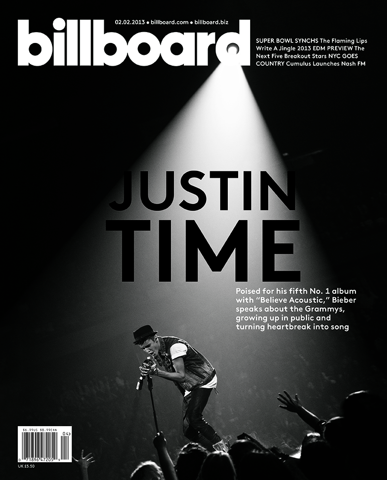
The language register that I will be using will be formal because I feel that it will connect with more people and this will fit my magazine because I am doing a mainstream type of magazine. The magazine that has inspired me doing a formal language is Billboard, I like their language register because it connects to all types of people and all backgrounds.


Wednesday, 15 January 2014
Genre of music
My preferred genre of music is R&B I have chosen this genre of music because I listen to this type of music for most of the time. These are just some of the artist that I listen to, I like this type of music because of the beats and rhythm added to the songs.
This is one of my favorite R&B songs of all time, I like it because it has a good tune to it and is one of them songs that you can't get out of your head.
The type of clothing that an R&B artist would wear would consist of snapbacks, Beanies, jeans, trainer type shoes, jackets, sweatshirts, t-shirts and other accessories. Over the years the fashion used by R&B has changed, they have gone from wearing things like long t-shirts, blue baggy jeans and some Timberland boots to wearing a lot more smarter clothing e.g. shirts, skinny jeans and more trainer like shoes. It has changed because the artist now have a bigger impact on fashion as some of the artist have their own brands of clothing e.g. BBC ( Billionaire Boys Club) which is made by Pharrell Williams and Black Pyramid which is made by Chris Brown. They have their own clothing lines because people like the way that they dress.

Examples of other text
I like the way that the front cover is laid out, there is not too much on it and that's why I like it.
In this front cover I like the font that was used for the title for the magazine.

This magazine got my attention because of the picture that was used on it, also the black and yellow stands out a lot.
In this magazine I like the picture that is used because it looks interesting and also the foreign text that was used on it got my attention.

The things I like on this front cover is the layout and the colours used.
I like the simple layout of this front cover and also the picture that was used.

I like the art work on this front cover and also I like the font used for the title of the magazine.
I like the simple layout for the magazine and I also like the colours used.
I like the colours used for this magazine cover.

I like the picture that is used in this front cover and I also like the layout of the magazine.
Tuesday, 14 January 2014
Analysis of existing Magazine titles

This magazine name came from the company BillBoard advertising as a trade paper (paper back book). The name relates to music because of the BillBoard charts which is a big music chart in the US which consist of all types of genres.

When I first saw the magazine Q I did not think that it was a music magazine. I don't know where the name came from, but other than that I think that its a good name because not many magazines have one letter as the title which is good because its like this magazine is one of a kind.
When the magazine was published for the first time the title was actually Volume, but then it was changed to Vibe. The title relates to music because vibe means in a verb "enjoy oneself by listening to or dancing to popular music". I like this title because I think it goes well on a music magazine.
NME stands for New Musical Express and I like how they have just used the initials of what it was called. It makes the magazine sound a lot funkier and modern. The only problem that I have with it is that is sound similar to enemy but other than that its a good title.
Analysis of colour palettes

On this colour palette there are very bright colours and I will use some of these colours because they will help to attract people to my magazine. Another reason why I might use some of these colours is because I will go well with the white background that I am going to use. The colours that I will use on this palette is the lime green, red and the blue, I have chosen these because I feel that they are the best colours to get someone's attention, also they will look the best on the white background that will be on my magazine.

The colours on the pastel row are very soft and would not go well on a magazine with a white background because people will find it hard to see them on the magazine, so I will not be using any of these colours. For the earth tone colours the are much more natural and really depends on the genre of music that I'm doing. If the genre of music is classical then some of the colours would look good but if I'm doing something like rock then them sorts of colours will not look good. The colours on mysterious are sort of darker then the rest, so if I was to use a colour from that row it would be the dark green because I think that it will look good for the double page spread.
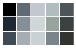
On this colour palette I like the black because I think that it will stand out the best on a white background, also black would be the best colour for the text on the double page spread because it is the best colour for that. Also black is the perfect match for white which means that they will fit together perfectly. So in my magazine I will be using the colour Black for the text on the inside of the magazine.
Monday, 13 January 2014
Sunday, 12 January 2014
Analysis of magazine covers, contents pages and double page spreads
Front covers
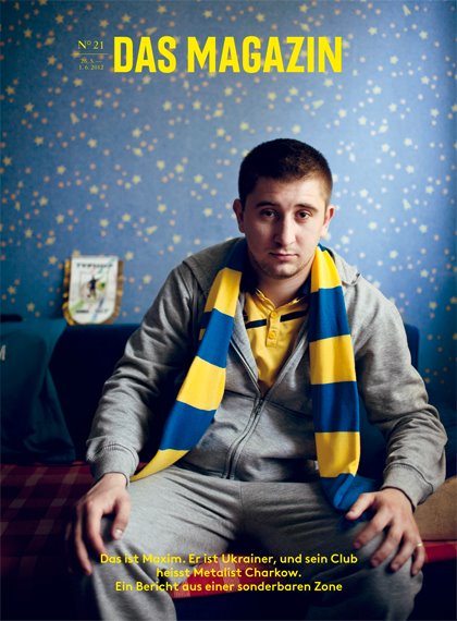
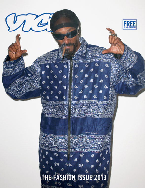
For this magazine cover I like the fact that they have stuck to three colour choices, it make the cover look good and it goes well with the picture that they are using as well as that I like the colours that they have chosen because its quite unusual. As for the font, it’s blocky and it would stand out to someone at the shops. Almost all the text is in capital letters apart from the actual masthead which has a lower case e at the end, but they do this with all of their magazines. As a result have mostly everything in capitals it stands out more on the shelves and will attract more people to it. Another thing that I like is that there is hardly nothing in the lower third of the magazine.

In this front cover I like the way that they have put a quote from the person who is modelling for the magazine, it makes the reader want to pick up the magazine and read it. The font that they have used is very similar to someone’s hand writing and I like it because it looks good and funky. I like that the main cover line is just the artists name and does not say anything else. The important information about the magazine is in the bottom left hand corner it includes the price, issue number and the barcode. Although the picture is covering just a little part of the magazines name readers will know what magazine it is because Q is a well-known music magazine within the UK. Things I don’t like about this front cover is that it has a border and I don’t think that is goes well with the magazine.

In this front cover I like the colours that they have used to match the black background, the white and the lime green attract people to look at the cover. I like the little circle to the right of the magazine because it gives the magazine something different. Again Eminem is covering the title of the magazine but it looks good and I like the fact that they have not covered the green within the D because they have used that colour for some of the other text on the front cover. Out of the three covers I have analysed I like this one the best because I like what they have done with the colours and how everything is laid out. The cover line is in the lower section of the magazine and not covering much of the picture and you have the other text in like a column which I think is unique because normally the text is everywhere.
Contents page

This contents page is for the magazine Vibe, what I like about Vibe’s contents page is the way that they have written the word contents they have broken it up. This not only looks good but stands out from other content pages in other music magazines. Next I like that the only colour in the picture is a bold one like red because it stands out this also helps because everything else is black, white or grey. The layout is very simple and this makes it easy for the reader to understand it. I like how they have used different fonts on this page because it makes it look fancy and yet formal. Lastly the styling used for the artist suits this type of colour scheme.

This contents page is for the magazine Q; I like the fonts that they have used in this contents page because it’s clear and very easy to read. Also for the numbers they have changed the colour so that it can be seen with ease. There is a lot of information on this page but the way that they have laid it out it makes it easy for people to look at the page without getting confused.

In this contents page I like the fact that they have put a chart for the songs that are currently out, I like it because I have never seen this before and it’s something different. I like the font that they have used for the word contents because it’s big and bold this will attract the reader’s attention. They have also used more pictures in this contents page which I like because it gives the reader a taste of what’s inside the magazine. The colours that they have used look very bright on the page, this is good because they can use them on the main parts of the page so that the reader knows where that part of the magazine is.
Double page spread

I really like the layout of this double page spread because it’s very simple in way. It’s very easy for the reader to follow and it’s nice to look at. I like how they have used the artist initials on the page because it looks interesting and the way that they have written it is good because the is no first line for the K. The colours that they have used are very good because black and yellow work perfectly and this will attract the reader’s attention to the page. Lastly I like how they have the picture on one side of the spread and the article on the other.

The first thing I like about this page is that it has a big J going down the middle of it, it not only looks good but it will attract the reader, also Q magazine do this with a lot of their magazines. Again I like the layout of the double page spread because the picture is on one side and the interview is on the other. The colours that they have used for these pages goes well because the red matches the red lighting in the picture and it all looks very neat, another thing about the picture is that it has a quote on it and I like the fact that the quote is on the picture and not on the other side.

In this double page spread I like the fonts that they have used, it’s kind of an old school cartoonish type of font. Also at the top of the page I like that some of the text is changing colours it looks very eye catching. The white background makes everything on the page stand out and the fact that it says summer time they have used very light colours. The graphic circle that overlaps some of the text makes the reader want to look at the page, also the styling of the artist goes well with the page. But the fonts that they have used for the main text looks boring, so I think that they should have used a more interesting font for that part of the page.
Tuesday, 7 January 2014
Subscribe to:
Comments (Atom)